引き続きComponentライブラリを作っていきます。
技術スタックは下記の通りです。
- TypeScript
- React
- Bulma
- vite
- Bulma
- Storybook
- ESLint
- Prettier
- asdf
Buttonコンポーネントを作る
HTMLの <button /> に対してBulmaでデザイン装飾をしたり、イベントハンドリングを簡易に行えるようにします。
まずは装飾のための型を定義します。
それぞれ、Bulmaでボタンの色・サイズを指定する時のclass名と一致させています。
type ButtonColor = 'is-primary' | 'is-warning' | 'is-danger'
type ButtonSize = 'is-small' | 'is-normal' | 'is-medium' | 'is-large'
<button /> のtype(button/submit)を指定するための型も定義します。
type ButtonType = 'button' | 'submit'
Buttonコンポーネントの引数のinterfaceを定義します。
interface Props {
  children: ReactNode
  className?: string
  color?: ButtonColor
  isOutlined?: boolean
  onClick: () => void
  size?: ButtonSize
  type?: ButtonType
}
先ほど定義した型を利用するcolor/size/typeの他に下記の引数を用意しました。
- children: Buttonコンポーネントの内部の表示を渡す
- className: 親から渡すクラス名
- isOutlined: 枠表示の装飾を適用するかどうかのクラス
- onClicked: クリックイベントのハンドラ
最後にButtonコンポーネント本体を作成します。
前回作成したuseClassName hookを利用し、デザイン装飾に関する引数を適宜加工しつつ_classNameとしてまとめます。
export const Button = ({
  children,
  className,
  color,
  isOutlined = false,
  onClick,
  size,
  type = 'button',
  ...props
}: Props) => {
  const _className = useClassName(
    className,
    'button',
    color,
    isOutlined && 'is-outlined',
    size,
  )

  return (
    <button className={_className} onClick={onClick} type={type} {...props}>
      {children}
    </button>
  )
}
storyの作成
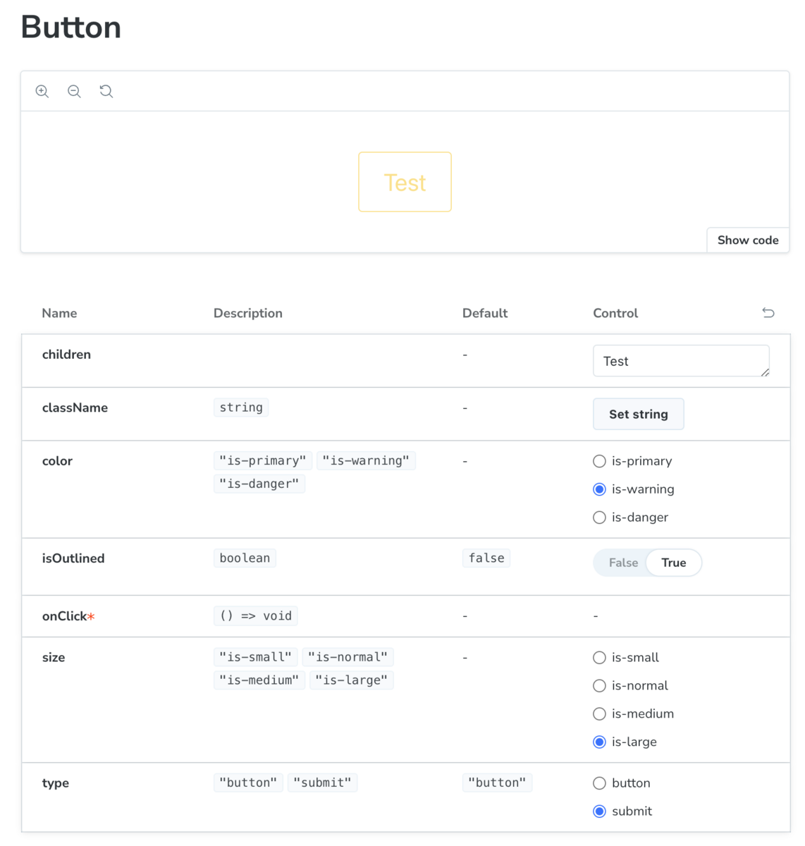
動作を確認するためにStorybookのstoryを作ってみます。
今回は、Storybook導入時に自動で作成されるstoryを元に簡易に作ってみました。
(Button.stories.ts)

import type { Meta, StoryObj } from '@storybook/react'

import { Button } from './Button'

const meta = {
  title: 'Components/Button',
  component: Button,
  parameters: {
    layout: 'centered',
  },
  tags: ['autodocs'],
} satisfies Meta<typeof Button>

export default meta

type Story = StoryObj<typeof meta>

export const Default: Story = {
  args: {
    children: 'Button',
  },
}
動作確認をしてみます。

Storybookが引数を認識して自動で表示切り替えの仕組みを作ってくれています。 無事にBulmaのクラスを適用できているようです。
あとがき
最近は機能開発のかたわらで業務のアジャイル化に取り組んでいます。
また始まったばかりですが、効果が出そうな感触があって楽しみです。
トラックボールを使っていたのですが、少々の不都合がありトラックパッドを買ってみました。
こちらも今後の活躍が楽しみです。